
How design, creativity, and customer attention are shaping the next wave of direct mail.
By Jesse Freitas
Marketing Director, Growmail
Postcard advertising remains a local marketing staple and creativity in design has never made a bigger difference in direct mail campaign success.
Direct mail has never gone out of style, but it’s definitely having a moment. With digital fatigue hitting inboxes and ad feeds, businesses are rediscovering how tactile, visual, and fun postcards can be.
As our own Design Lead, Adriana Aldrey, puts it, “People stop when something feels different. Whether it’s a clever pun, a bright color, or a playful layout—anything unexpected earns a second look.”
In other words, creativity isn’t a bonus in 2025—it is the way to stand out regardless of where you are pushing out advertisements.
Playful and Unexpected Always Wins
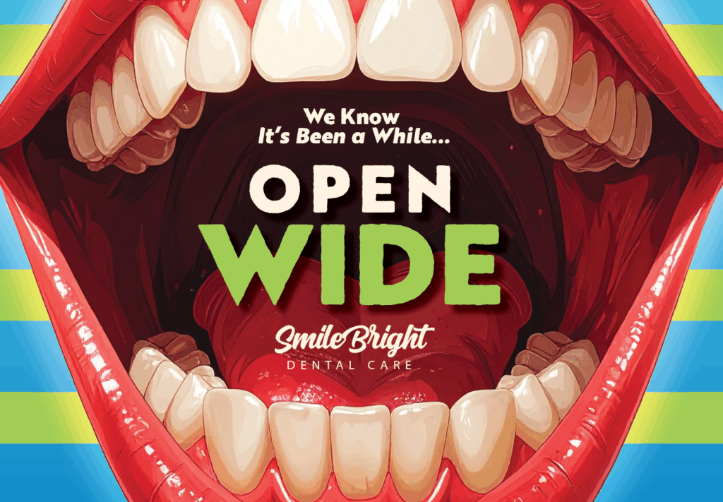
Some of the most successful mailers this year came from businesses that aren’t afraid to have a little fun—especially in categories where you wouldn’t expect it.
“Dentists are some of our boldest clients,” Aldrey laughs. “They love using humor, puns, or even a little shock value to get attention. It might sound surprising, but those are the cards people remember.”
That creative confidence translates to higher engagement. Think of postcards that double as something else—a movie ticket, a greeting card, or even a mini puzzle. When your design sparks curiosity, you’ve already won half the battle.
QR Codes Are Here to Stay
Several years ago, QR codes were just starting to be fully utilized. Today, they’re a standard.
According to Aldrey, “Almost every postcard we design includes a QR code. It’s simple, trackable, and gives the reader one clear next step.”
In 2025, the trend is about placement and intention. QR codes should feel integrated—not slapped on. The most effective designs balance a strong visual hierarchy (headline, offer, CTA) with a clean, easy-to-scan layout. Bonus points for connecting the QR code to something visual, like a branded landing page or an incentive video.
Seasonal Is Safe. Trendy Is the Opportunity.
Seasonal campaigns—spring cleanings, holiday greetings, back-to-school—still dominate the direct mail calendar. But Adriana sees a shift on the horizon.
“Most of our clients play it safe with seasonal designs,” she explains. “But the trendy stuff—retro fonts, minimalist layouts, or bold, 90s-inspired palettes—that’s what feels fresh. It’s a missed opportunity when brands don’t try it.”
2025 design research agrees. Nostalgia and bold simplicity are driving creative direction across both digital and print. Think high-contrast color blocking, oversized typography, and simple emotional triggers. In a stack of mail, subtle rarely wins. Are we really back in the Y2K era?! 🤯
Make the Message Clear (and Fast)

“Keep it short, clear, and bright,” Aldrey emphasizes. “The best postcards say one thing—and say it well.”
Readers should know what they’re looking at within seconds. Use vivid color, white space, and large fonts. Avoid long paragraphs or unnecessary detail.
As Adriana puts it, “Nobody’s reading reviews on a postcard. They’ll find that online. The design’s job is to make them look up and take action.”
AI Is Helping—but Not Replacing Designers
AI tools are becoming part of the creative toolkit, but they’re not replacing human design just yet.
“AI can help generate an image when stock photos don’t cut it,” says Aldrey, “but it still struggles with small details. You might get a great background—then find out the person has six fingers.”
In 2025, designers are using AI to accelerate ideas, not to finish them. The magic still happens in the details—the human eye, the typography choice, the emotional connection.
AI Design Tools Worth Exploring
If you’re testing ideas before you brief a designer, here are a few tools that can jump-start creative direction:
- ChatGPT (with image generation enabled) – Great for brainstorming postcard concepts, headlines, and layout themes.
- Canva Magic Studio – Instantly turns prompts into polished marketing visuals and helps non-designers build layouts.
- Adobe Firefly – Ideal for generating high-res print-ready images with better control over texture and realism.
- Midjourney – Strong for moodboards, concept art, or stylized photography prompts.
- Runway ML – Useful if you want to animate postcard visuals or create short looping video mailers for digital previews.
Each can be part of your pre-production workflow—not to replace a designer, but to bring better ideas to the table.
A ChatGPT Prompt for Postcard Concepts
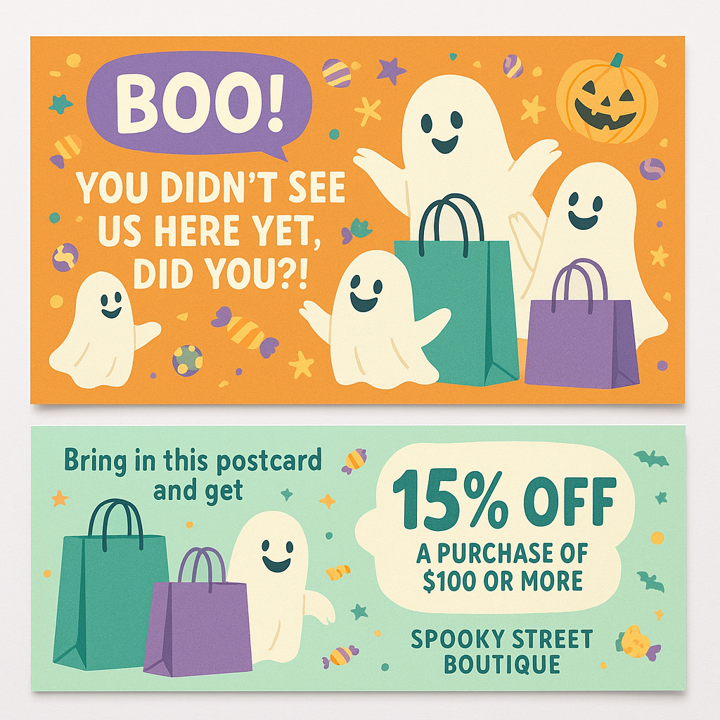
Prompt Example: “🎃 Growmail AI Postcard Visual Prompt (Halloween Edition)”
![]() Download a copy of the prompt below to save and customize on your own.
Download a copy of the prompt below to save and customize on your own.
Or copy, paste, and customize this version:
**(replace [BUSINESS NAME] with your own store name)
You are an expert direct mail designer for Growmail.
Create a Halloween-themed promotional postcard for a retail store called [BUSINESS NAME] that wants to attract customers during the month of October.
Design details:
Include the headline: “BOO! You didn’t see us here yet, did you?!”
Use friendly Halloween imagery such as ghosts, pumpkins, and candy — nothing dark or gory.
Make the ghosts look cheerful and playful, not scary.
Include shopping bags to show it’s a retail promotion.
Keep it bright, colorful, and family-friendly.
Add the call-to-action: “Bring in this postcard and get 15% off a purchase of $100 or more.”
The design should look like a real postcard — front and back layout.
Front: Main headline, ghosts, and store theme.
Back: Discount details, store name, and space for mailing address.
Use [BUSINESS NAME] [PUT BRAND COLOR & STYLE] clean, modern aesthetic with soft Halloween colors (orange, teal, white, lavender).
Overall tone: Fun, inviting, slightly spooky but friendly and clear.
Output:
Generate a realistic postcard mockup showing both the front and back sides.
Optional note for DALL·E or Midjourney users:
“Colorful Halloween postcard with friendly ghosts and shopping bags, bold headline text ‘BOO! You didn’t see us here yet, did you?!’, bright pastel orange and teal palette, cheerful design, Growmail direct mail style.”
Creative Freedom = Marketing Growth
When postcard design feels formulaic, it’s often because we overthink the rules. Same size, same layout, same message — rinse and repeat. But audiences don’t stop for “the usual.”
Creative freedom isn’t about being wild. It’s about giving yourself permission to test, tweak, and trust your instincts. Change one element at a time — color, typography, image style, or tone — and watch how response shifts.
If you’ve been sending the same seasonal layout for years, ask:
- What would this look like if it were a magazine cover?
- Could my offer feel more personal — or more playful?
- What happens if I say less and show more?
Remember – small experiments drive big insights.
Maybe it’s using bold typography one quarter, a retro color scheme the next. Maybe it’s swapping predictable imagery for something unexpected — humor, minimalism, or metaphor. The goal isn’t to abandon consistency; it’s to keep your brand alive in the mailbox.
Just always come back to who you are as a brand and business to guide how you bring a little creative freedom to your postcard design.
What to Try Next
Here are a few postcard ideas worth testing in your next campaign:
- Interactive layouts — Word searches, punch-out coupons, or scannable challenges.
- Limited-edition designs — Celebrate milestones or anniversaries with collector-style art.
- Mini series mailers — Send a 3-part campaign that builds anticipation.
- Retro revival — Think 80s postcards, diner menus, or vintage travel posters.
Final Thought
Postcards may be small, but they carry big opportunities. The brands winning in 2025 are those that treat their direct mail like creative storytelling and look to make a splash in the mail.
Because in the end, it’s not just about getting in the mailbox. It’s about earning someone’s attention once you’re there.